A / Warmth & ease
Soft amber.
Room to breathe.
Warm highlights, gentler tonal separation and readable shadows make the landing feel more welcoming. Skin retains warmth and the concrete feels less severe.
Color grading / A field guide
A quiet moment. A warning. An unfamiliar world. See how color changes the way a scene feels.
Find your feeling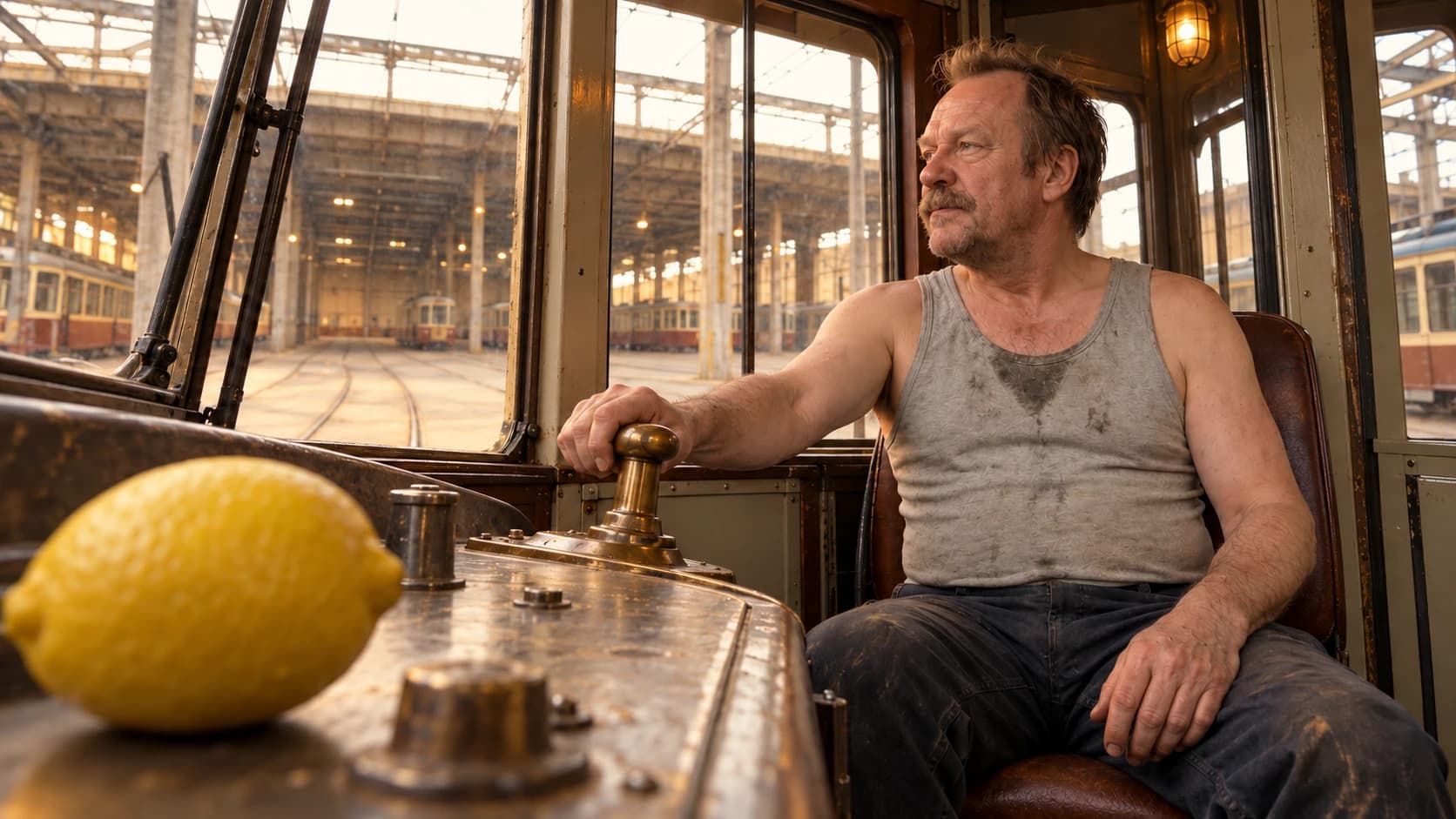 Loading the look…The last tram / Low foreground perspective
01 / The look library
Eight starting points. One scene. Choose a look, compare the image, then see what changed.
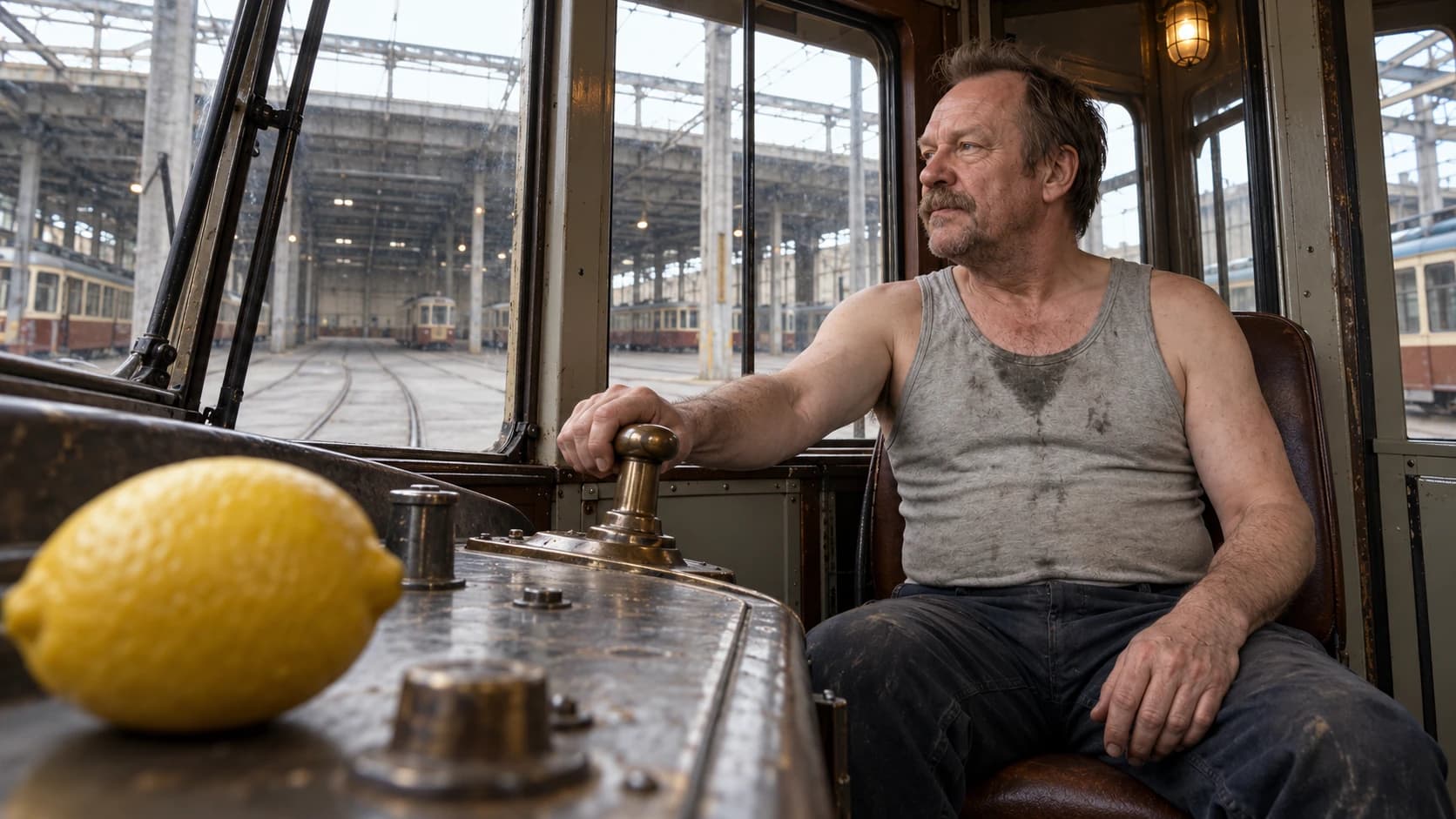
The last tram · AI-generated scene and color-only AI edits. Fine details may vary between versions.
A palette for reading color relationships. Not a LUT or a measured sample.
Quiet warmth / Image prompt
Add this grade to your own image prompt, or copy the complete tram scene.
COLOR GRADE
Build a quiet, naturalistic warm grade with restrained amber in the highlights, cream-colored bright neutrals and subtle warm earth tones. Keep the lower midtones and shadows gently neutral and readable. Preserve natural skin-tone variation, believable fabric colors and soft highlight roll-off. Use modest saturation and gentle contrast without flattening the image or turning every neutral yellow. Preserve all existing light sources and the time of day. Retain fine photographic texture; avoid broad bloom and heavy grain.
Replace the COLOR GRADE section in an existing Brutalisti prompt. Keep one set of grading instructions in your prompt.
Image prompts describe a creative direction. They are not exact grading settings or a promise of identical pixels.
Look 01 / Warm & reassuring
A softer world, with warmth in the light and enough neutrality for faces and everyday materials to stay believable.
Warm does not automatically mean calm. The expression, framing and light still set the emotional context.
02 / Read the relationship
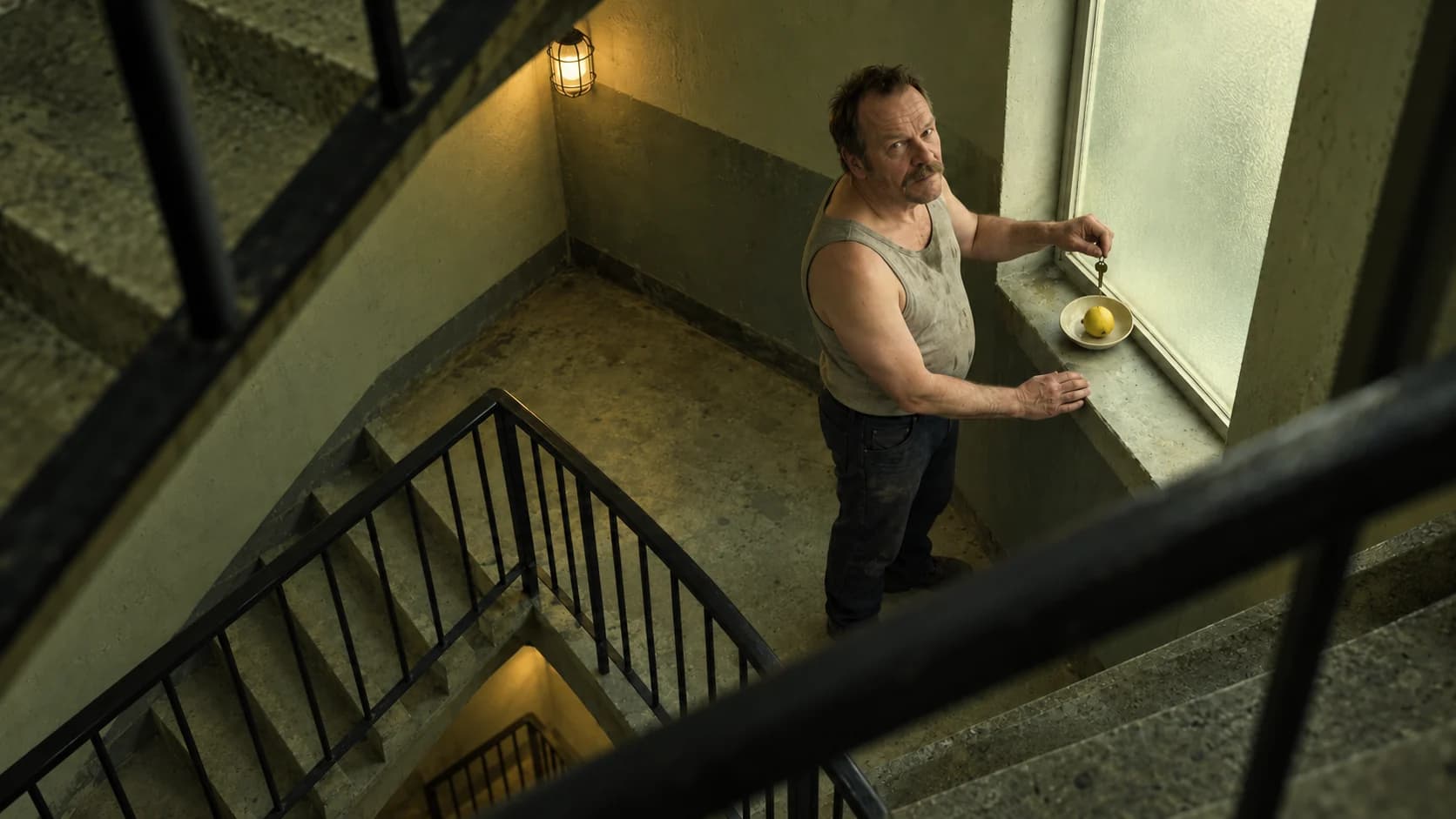
A color does not carry a fixed emotion. Amber light with gentle contrast can feel reassuring. Shift the relationship toward green and denser shadows, and the same space can become uneasy.
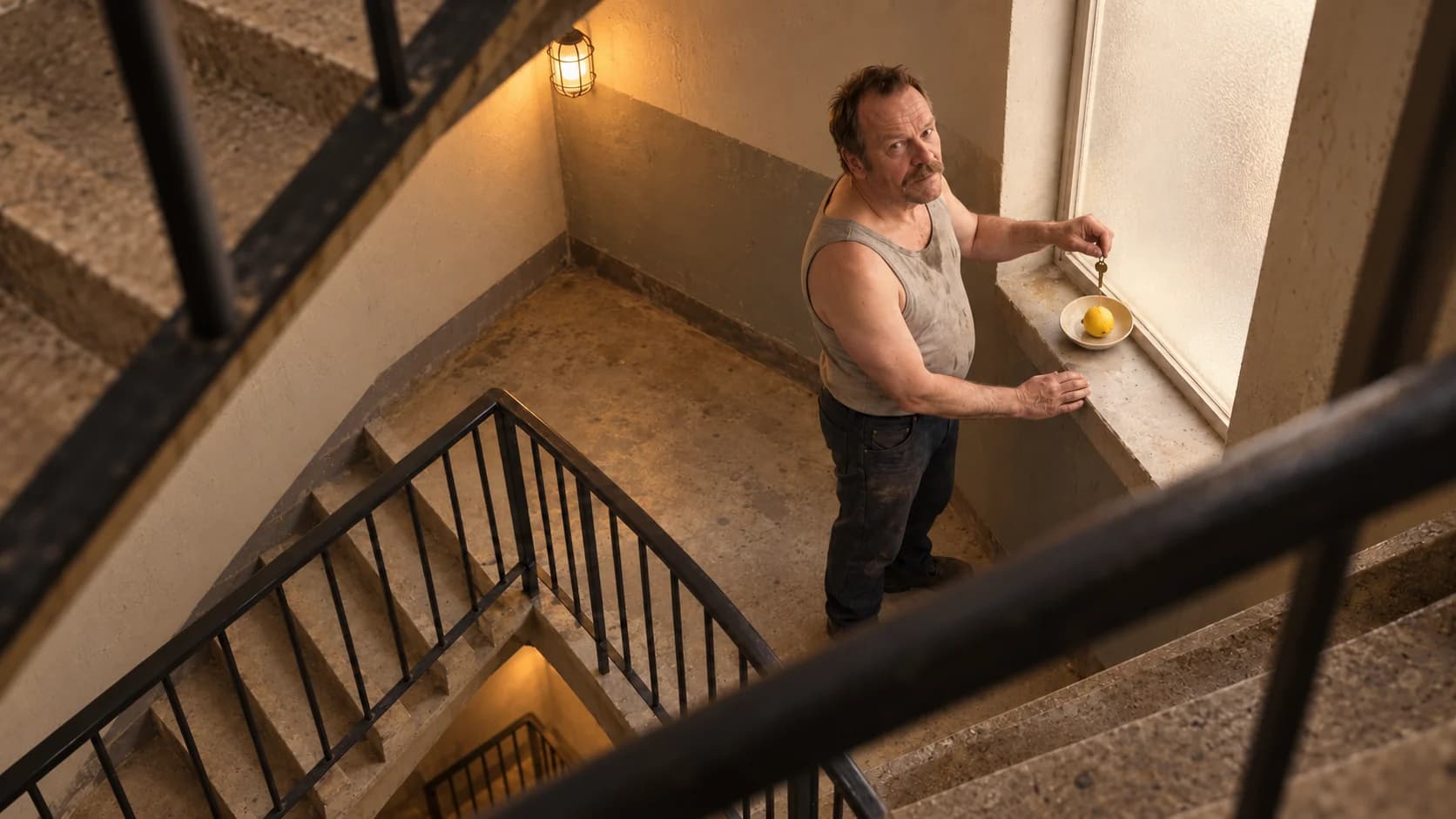
A / Warmth & ease
Warm highlights, gentler tonal separation and readable shadows make the landing feel more welcoming. Skin retains warmth and the concrete feels less severe.
B / Unease & suspicion
A green bias and denser tones change the relationship between skin, concrete and the lemon. The unusual camera angle remains the same; the color reinforces a different reading.
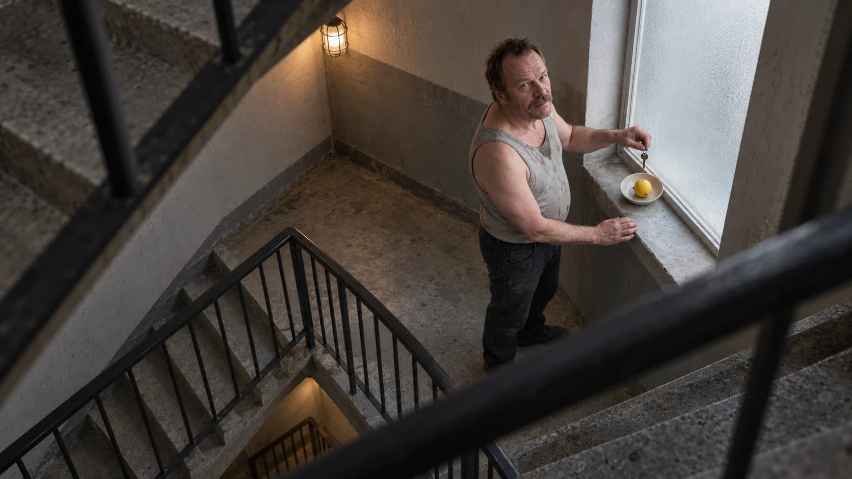
Display-ready balanced master. This is an AI-generated still, not camera RAW or log footage.
The suspended key · AI-generated scene and color edits. These are creative readings, not universal rules: cool blue can feel peaceful, and bright images can still be frightening.
03 / A world built with light
A neon look starts with light in the scene. Grading shapes its color and intensity; it does not automatically create believable new illumination.
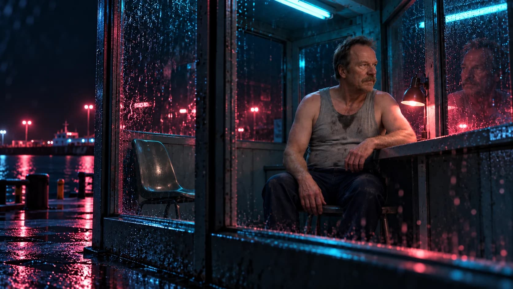
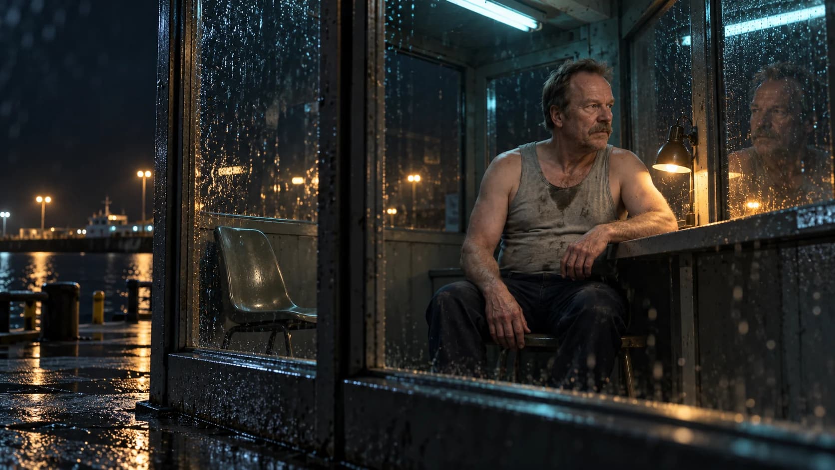
The reflection that waits
An oblique view through wet glass makes the face, its reflection and the empty chair share the frame. Cyan and warm practical lights give the grade something real to separate.
The neon interpretation turns some warm highlights toward rose and magenta, deepens the cool surroundings and gives the existing light more color contrast. Compare it with the restrained daylight tram treatment above.
AI-generated scene and color edit. Fine details may vary. The light sources remain part of the scene in both versions.
04 / Behind the grade
Establish exposure, white balance and consistency between shots. For camera footage, use the correct input interpretation and color management.
Color correction / A consistent foundation.
Shape the tonal range and choose where color lives. Decide what should draw the eye, how skin relates to the environment and which colors should stay quiet.
Creative grading / An intentional visual language.
Check faces, deep shadows and bright surfaces. Match neighboring shots and review the output. Grain, bloom and halation are separate, optional texture choices.
Finishing / A coherent result across the sequence.
Which color you see: yellow, red, blue, cyan. Moving a yellow toward green can change its relationship to skin and surrounding neutrals.
How vivid or restrained a color appears. A narrow, muted palette can feel different from the same hues at full intensity.
The separation between dark and bright tones. Softening that separation can feel gentle; stronger separation can give an image weight.
The warm/cool and green/magenta balance of an image. Neutralizing an unwanted cast is a starting point, not a requirement for every creative look.
Shadows, midtones and highlights. A colorist can shape them separately, keeping skin warm while allowing a background or the shadows to feel cool.
A predefined mapping from input colors to output colors. It expects a particular input and output context; it does not balance exposure, match shots or finish a film by itself.
A look is a relationship, not a universal recipe. The same settings can behave differently with different exposure, lighting and source color spaces. These examples teach visual choices rather than exact Resolve settings.
A note from the cinema
Roger Deakins describes building much of the film’s color in camera, through lighting and production design. Its worlds are a useful reminder to plan color before the final grade.
Read the ASC conversationCinematographer Hichame Alaouié describes a sunny, colorful period and a colder, starker aftermath. Film stock, filtration, lighting, costume and décor all contribute to the distinction.
Read the Kodak interviewFor a deeper technical introduction: Blackmagic Design’s color workflow and official training.
Take the look into a scene
About these images: three original AI-generated scenes featuring the Brutalisti character, with AI-assisted color interpretations. “Balanced” means a display-ready starting image, not a camera-original capture. Small detail changes may occur between edits. Your screen and viewing conditions also affect the appearance.